Somewhere out there amidst the slow-motion quasipocalypse around us exists the beginnings of a general election campaign between (as yet presumptive) Democratic nominee Joe Biden and the “I’m not a doctor” incumbent President Trump. What’s going to happen? Who knows! But as I’ve said before (most recently on a panel at a political prediction conference that Flip Pidot put together), I tend to trade these things by reacting to the present and making plans for how possible future events could influence market prices. For example, in the short term, I’m wondering if the next set of Trump v Biden polls will continue to push Joe higher in the various state markets (and the winner market).
But for now let’s set all the intervening drama between now and November 3 aside and skip ahead to the fun part: election night.
The Motivation
I kind of suck at elections. There, I said it. Not to say that I lose money on them, just that I frequently don’t make as much as I should, and it’s easily the softest part of my game. I have a good overall sense of political geography, but not the fine-grained understanding where I know basically what every county in a given state is doing. And on election nights, it REALLY helps to know that stuff. If you’re playing a turnout or margin of victory market (or even a winner market when it’s close), you’ve got to be able to estimate quickly and reliably how much vote is remaining and how that vote might fall. This requires work, and often for big multi-contest elections I never do enough of it and end up just sort of clicking buttons. This post is hopefully the first in a short series detailing what steps I’m taking to shore up my play in this arena.
The Goal
Wouldn’t it be great to be able to read the results coming in from 7:30 – 8:30 on election night and be able to predict how states that report later will break? Is it possible to take extremely early results from, say, random counties in Kentucky/Vermont/West Virginia/Indiana that report first and extrapolate something useful from them? Basically, can I build a better, faster, and more profitable version of The Needle?
The Hypothesis
There’s a lot that goes into live-forecasting an election. For one, you need to be able to treat absentee/early vote different from election day vote. You also need to know how homogeneous the precincts are in each county. You need a sound method for modeling uncertainty around your prediction. You need to have scrapers working for all the various results providers (NYT/AP, DDHQ, and CNN/Edison) and a way to select the freshest results among them. But after all that, a basic level you need some way to model how one county’s reported results influence what another county might report. Is this possible? In order for it work, my hypothesis is that counties that are similar to each other demographically, by size, and in terms of past electoral history ought to continue behave like each other in elections going forward.
Exploring the data
So far, I’ve not systematically approached this idea – my goal in the early going is to build a rough spreadsheet that I can use to check my ideas before more rigorously testing them. (And if it doesn’t work at all, at least I learn some more political geography on the way). What I’ve done is to gather data on each county in the country (demographic and political), then simply do some linear regression on a bunch of variables to see if I can’t find, for any given county, the most similar counties to it in the nation. This is what that looks like:
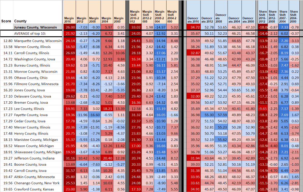

The top row of the spreadsheet shows where I’ve typed in a target county: Juneau County, Wisconsin. The rest of the spreadsheet then does some vlookup() magic to pull out all the counties that are closest to Juneau County across several dimensions. Here, these are shifts in margin and turnout from 2012-2008, 2008-2004, 2004-2000; total dem share and total turnout in 2012, 2008, 2003, and 2000 (I use log(turnout)); and racial demographics (fraction white/black/native american/asian/other/latino). In this example, I am NOT using any information about 2016 – yet you can see that the average of the ten closest counties to Juneau County end up doing a pretty good job predicting the swing in Juneau from 2012 to 2016. (Note I’m also not doing any weighting on physical distance of counties, yet this emerges naturally from the data – so far turning off distance as a factor doesn’t seem to make a huge difference but I’ll have to explore it further).
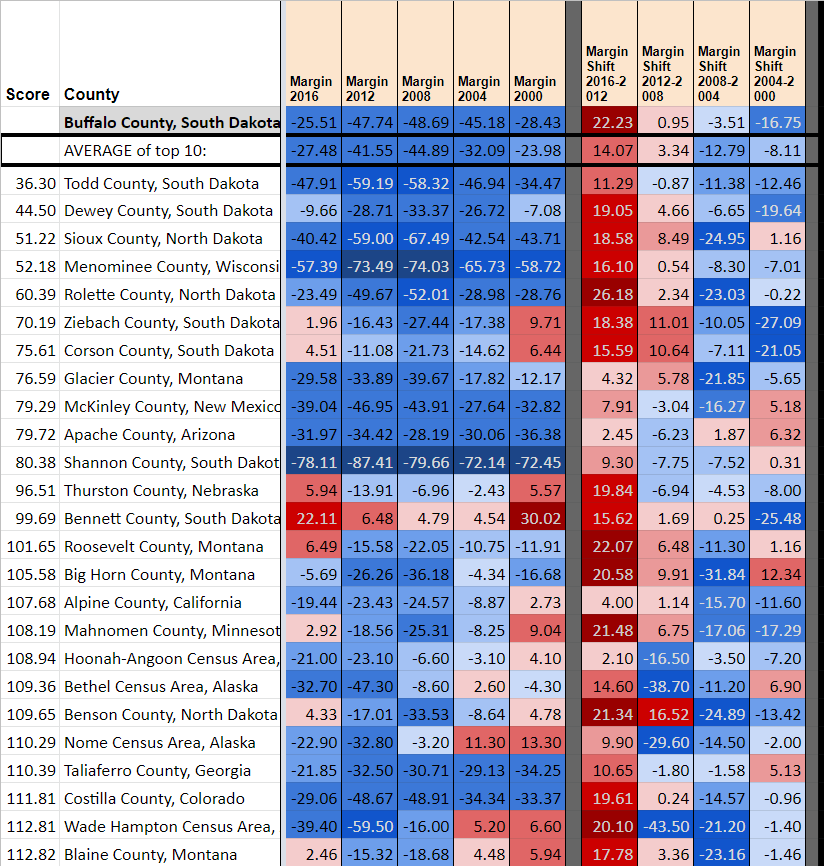
Here are some other sensible groupings it makes:

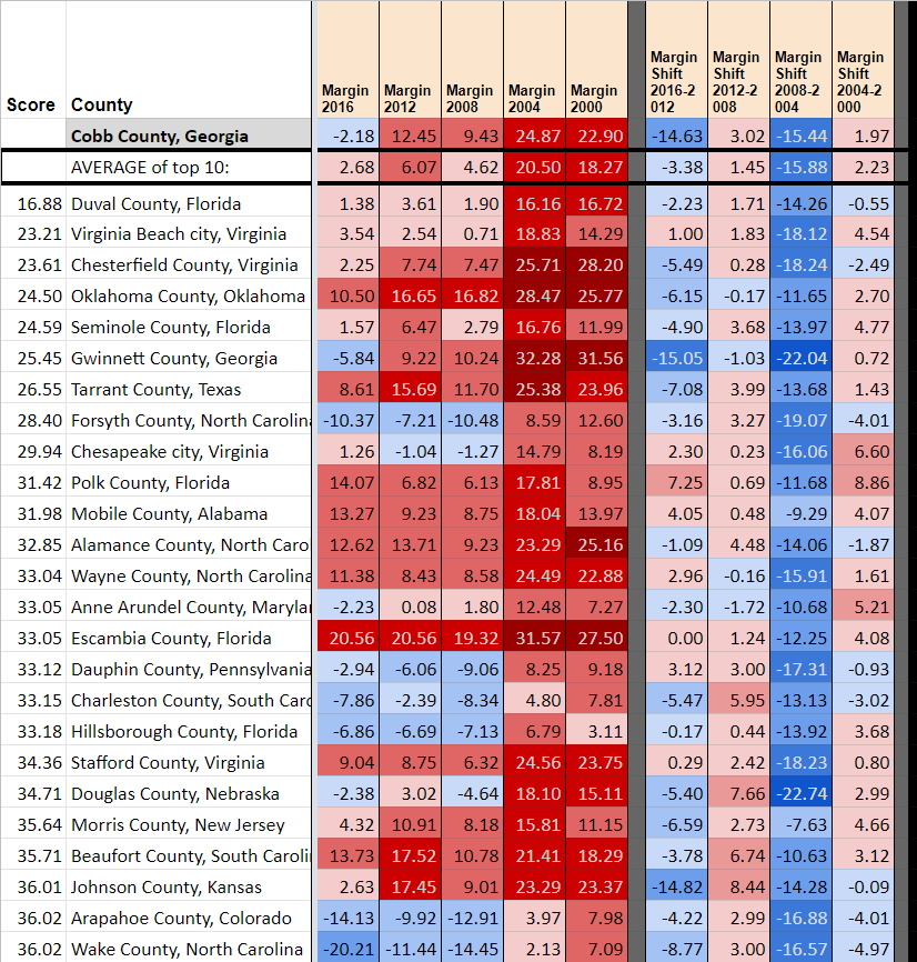

Sometimes it doesn’t work
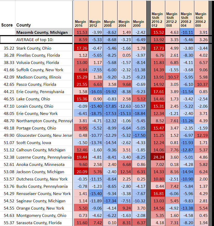
As you can see with Cobb (GA) and Pasco (FL), the most similar counties based on info from 2012 and earlier don’t necessarily shift to the same extent as the target county. This is particularly true for bigger Obama-Trump counties in the upper midwest (smaller ones, like Juneau (WI) are predicted well as shown above). Here, for instance, is Macomb County, MI. First are shown the most similar counties excluding all 2016 information, and next what the most similar counties are with 2016 included.

So what’s next
Well, it’s cool that it sort of kind of works. But it also fails to pick up on the magnitude of some of the 2012-2016 swing for both Obama-Trump midwestern counties and, to some extent, for suburban counties everywhere. I can try adding additional weighting schemes, or maybe simply adding midterm data (though if I’m doing national correlations I’d rather not have different inputs in different states). Perhaps there’s some additional category I can consider weighting on (education comes to mind – maybe I can find some measure of urban/suburban/exurban/rural?).
Finally, finding the closest counties is just a test of the overall approach. In principle, counties that are quite distant from a given county on any of these metrics could still provide useful input. We shall see!
