The tl;dr:
-Models output predictions for each state
-Models also forecast median margins of victory; it is better to use these to compare one model to another
-When looking at national forecasts, the relationship between popular vote MoV and win probability is distorted by the electoral college
Probabilistic forecasts only get to live in one reality
Yesterday, pollster Patrick Ruffini posted a facially reasonable take on the state of election forecasting:
This is a subtweet of the epic Nate Silver – G. Elliott Morris debates on model uncertainty (they were going at it hard last night); Morris’ model has Biden at 90%, Silver’s model isn’t out yet but is expected to be much lower, perhaps near 70%. Ruffini is effectively saying “Chill guys. If Joe wins we’ll never know which of your models was the best because reality only gets to play out once.”
So is there no way to differentiate the skill of a 90% forecast from a 70% forecast?
It’s absolutely true that election modelers are predicting a singular event. The forecast is made, the election happens, and that’s that. We don’t have the luxury of peering into multiple parallel universes to see what happens in 100 of them to see whether Biden really did win 90% of the time or if it was only 70% of the time.
Yet hope is not lost. Whatever future timeline we end up in, we should nonetheless be able to say something about which forecast was better. If a forecast implies Biden is extremely likely to win and he only barely wins, that forecast was worse than the one that said it would be close. Consider 2016: several models had Clinton at 98% or better, Nate Silver’s had her only in the high 60s and low 70s. Suppose that instead of Trump, Clinton had barely held on in MI/WI/PA and won. Were the 98% forecasts better? They’d have a better Brier score! But no, they would have still sucked. Why?
There’s a relationship between win probability and margin of victory
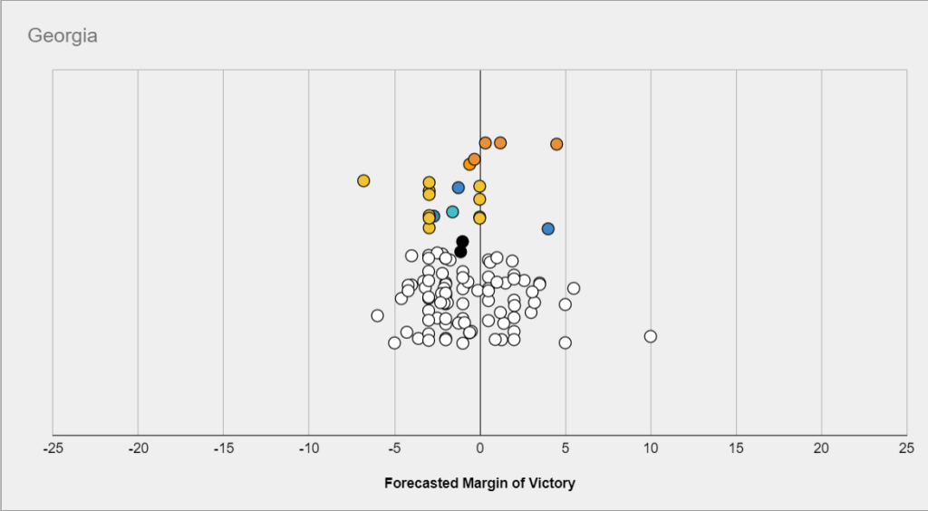
This is intuitively obvious but worth exploring. Let’s take a Georgia. If Georgia is a true toss-up, then we shouldn’t be expecting either Joe or Trump to win by 5 points. Maybe sometimes that happens, but more often than not the margin of victory is under 1.5 points either way. Maybe Trump is slightly favored there (not sure I agree, but let’s say he is), but there’s enough uncertainty we can’t say for sure that he’ll win. Maybe he’s worth 60c. Here’s a quick and dirty MSPaint diagram of what’s going on with margin of victory in a 60/40 race, as an example:

We have some sort of median forecast margin of victory (Republican by 1.5 points), but we’re uncertain! Polls have margin of error, so do polling averages, and so does our forecast. The most likely outcome is R+1.5 but it’s not the only outcome. The full probability distribution is shown with the example bell curve above (note that I have no idea how accurate this distribution is). We get the win probability from how much of this probability distribution lies on the R side of the spectrum and how much lies on the D side. Here, at -1.5 points, about 60% of the area under the curve belongs to the R candidate while 40% belongs to the D candidate.
Models are in the business of generating these probability distributions and as a result they all tend to output both win probabilities and margins of victory (others go further and suggest turnout numbers, vote shares, and so on), which allows us to compare the two measures systematically:
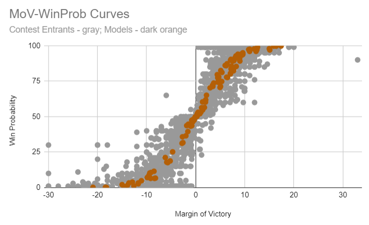
In this plot, each point is a particular state forecast (these span all states included in my 8/1 Contest). On the x-axis is the forecast margin of victory (from losing by 30 points to winning by 30 points) while the y-axis shows the win probability. There are two data types shown here: modelers are shown in dark orange, and individual contest entrants (humans) are shown as grey points.
Let’s take just the modelers for a moment. You can see that if they think the margin of victory is near zero, they think that the race is a toss-up (near 50% win probability). And once the margin gets out to +4.5 points or so, the race is already 75%. Note that I’m including all modelers here in dark orange and yet there’s comparatively little spread overall (perhaps at a later date I’ll break them down individually to see what if any differences there are). And while 538’s model isn’t included here (it hasn’t been released yet), the overall curve very closely tracks what their 2018 midterm model showed:
Margins > win probabilities for scoring an election forecast
Since it so happens that all modelers agree on the general relationship between win probability and margin of victory (more specifically: so far no modeler has a substantially steeper or flatter curve than any other), it’s fairly straightforward to simply compare them on median forecast margin. Whoever gets closest did the best! (And this is why margins are the dominant scoring factor for my contest). This is wonderfully intuitive: if your forecast is calling for a close race, then the race ought to be close. If it’s a blowout, your forecast probably sucked.
What about national forecasts?
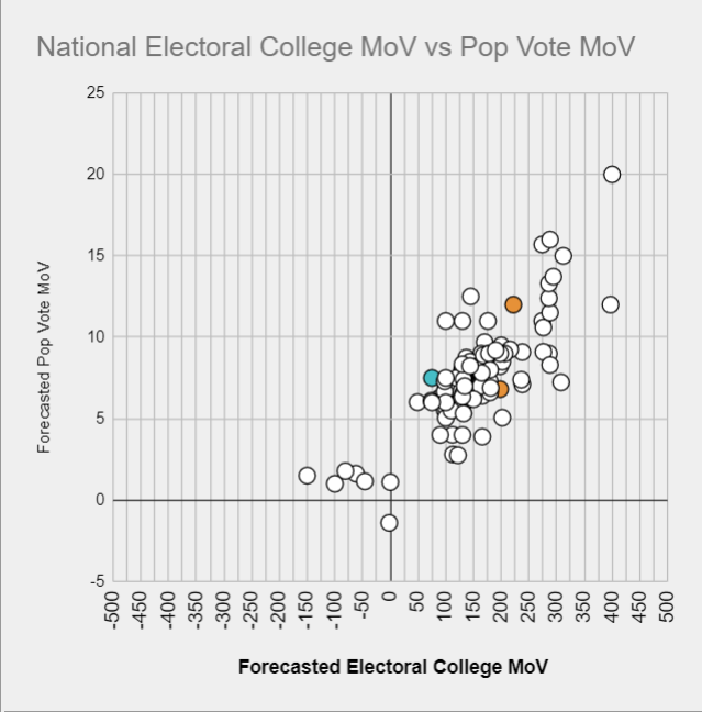
How does margin relate to the overall chances to win the presidency? Thanks to the electoral college, this is not as straightforward. Voters of different parties are not evenly distributed in all the states and as 2016 illustrated one party can thus lose the popular vote while winning the electoral college. A 1.5 point loss in the popular vote for Trump is probably an 80% win chance for him.
Further, this electoral college edge moves from election to election (as individual states drift one way or the other). We can’t know that Joe by 2.1 is the 50/50 line like it was in 2016: the line may well have drifted up to Joe by 3 (as suggested below). Dave Wasserman has argued in the past that it’s even conceivable that Trump can win some elections where he loses the popular vote by 4-5 points.
Where are we now? Based on all contest entrants and modelers, the 50/50 line is somewhere around 3.1 points (where the linear fit to the data below crosses the y-axis; despite this curve being almost entirely generated by human contest entrants, G. Elliott Morris’ model has 3.2 as the 50/50 line):
Translating this into win probabilities across the whole range is a bit trickier – I’d love to see a modeler put out a simple chart of pop vote margin vs win probability (perhaps Nate Silver will give us these data). But roughly speaking: +3 points is probably around 50/50, +4-5 is 60-70, +6-7 is 75-85%, +8-9 is high 80s low 90s, and +10 and up gets to be academic.
To sum up
Yes, we’ll be able to tell 70% and 90% forecasts apart. A 90% national forecast is going to have a much closer TX/GA/IA/OH margins than a 70% national forecast. A 90% national forecast implies a much higher popular vote margin than a 70% forecast, and so on. So fear not, we will know whether Nate Silver’s model is the champion this year or whether The Economist’s can dethrone it (or if any other modeler beats them both). And if you’d like your shot at beating them all, start thinking about your entry into my next contest (entries will open August 25th and close September 1)!